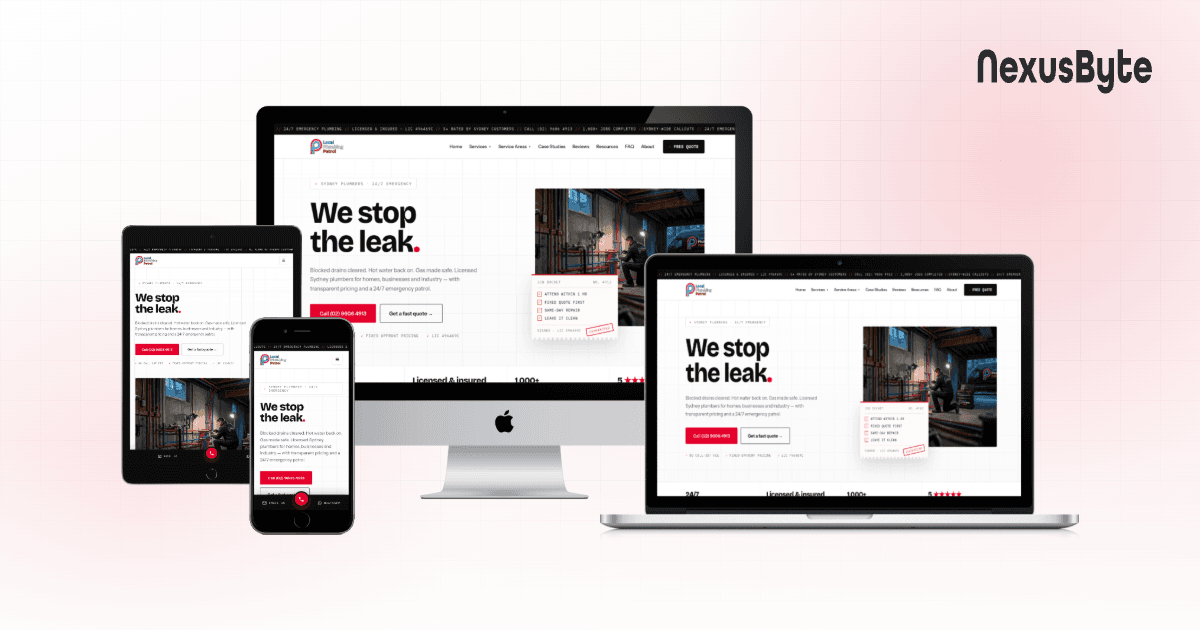


Responsive Design: Industry Best Practices
Somewhere between the phone in your pocket, the tablet on the couch, and the widescreen monitor at the office, your website has to look and work perfectly on all of them. That is the promise of responsive design, and it is no longer a nice-to-have or a premium extra. It is the baseline expectation for any website that wants to be taken seriously.
The problem is that "responsive" has quietly become one of the most misused words in web development. Plenty of sites technically shrink to fit a phone screen, yet the text is unreadable, the buttons are impossible to tap, and the whole experience feels like a desktop site squeezed through a letterbox. True responsive design is a discipline, not a checkbox, and the gap between a site that merely resizes and one that genuinely adapts is enormous.
This guide sets out the industry best practices that separate professional responsive design from the amateur version. We will cover mobile-first thinking, fluid grids, sensible breakpoints, responsive images and typography, touch-friendly interfaces, performance, accessibility, and how to actually test the result. Whether you are commissioning a new site or trying to understand why your current one underperforms on mobile, these are the fundamentals that matter.
What responsive design really is
Responsive web design is the practice of building a single website that automatically adapts its layout, images, and content to whatever screen it is viewed on. Instead of maintaining a separate mobile site and a desktop site, you build one flexible codebase that reflows gracefully from a 360-pixel phone to a 1440-pixel monitor and everything in between.
The concept rests on three technical pillars: fluid grids that use relative widths rather than fixed pixel values, flexible images that scale within their containers, and media queries that apply different styles at different screen sizes. When these three work together, the layout stops being a rigid template and starts behaving like water, filling whatever container it is poured into.
What matters for a business is the outcome rather than the mechanics. A responsive site means one URL to share, one set of content to maintain, one site for search engines to crawl, and a consistent experience no matter how a customer arrives. It is the foundation that every other decision in modern web development builds on top of.
Design mobile-first, not desktop-down
The single most important shift in responsive design over the past decade has been the move to mobile-first thinking. For most Australian businesses, more than half of website visits now come from a phone, and in some industries such as hospitality, retail, and trades it is the overwhelming majority. Designing for the smallest screen first is not a constraint; it is a discipline that forces clarity.
Why starting small makes everything better
When you begin with a phone-sized canvas, you have no room for clutter. Every element has to justify its place, which naturally pushes you toward a clear content hierarchy, a single obvious call to action, and navigation that gets people where they need to go without fuss. You then progressively enhance that clean foundation for larger screens, adding columns, secondary content, and richer interactions where the extra space allows.
The opposite approach, designing a beautiful desktop layout and then trying to cram it onto a phone, almost always produces compromises. Elements get hidden, text shrinks below the readable threshold, and important actions end up buried. Mobile-first flips the priority so the experience most of your visitors actually get is the one you designed with the most care.
Content priority on small screens
On a narrow screen everything stacks into a single column, which means the vertical order of your content becomes a deliberate decision. The most important message, the clearest value proposition, and the primary action should appear near the top, before anyone has to scroll. Secondary details, supporting information, and nice-to-have sections can follow. Getting this order right is often more valuable than any amount of visual polish.
Master the fluid grid
A fluid grid is the skeleton of a responsive layout. Instead of defining a container as 960 pixels wide, you define it as a percentage of the available space, or use modern CSS layout tools that handle the flexing for you. This is what lets a three-column layout on desktop collapse cleanly into a single column on mobile without any content spilling off the edge of the screen.
Use relative units, not fixed pixels
Fixed pixel widths are the enemy of responsiveness. A box set to 500 pixels wide is a problem on a 360-pixel phone the moment it appears. Best practice is to reach for relative units instead: percentages for widths, rem and em for spacing and typography so everything scales in proportion, and viewport units where you genuinely want an element to relate to the size of the screen. The result is a layout that bends instead of breaking.
CSS Grid and Flexbox do the heavy lifting
Modern CSS makes responsive layouts dramatically easier than the float-based hacks of the past. Flexbox excels at distributing items along a single row or column and handling alignment, while CSS Grid is purpose-built for two-dimensional layouts where you control both rows and columns. Powerful features let items wrap and resize automatically, sometimes producing responsive behaviour with barely a media query in sight. A capable development team uses these tools to build layouts that adapt intelligently rather than snapping awkwardly between fixed states. It is exactly the kind of engineering that goes into our custom web solutions.
Choose breakpoints based on content, not devices
A breakpoint is the screen width at which your layout changes, triggered by a CSS media query. The old approach was to pick breakpoints that matched popular devices: one for the iPhone, one for the iPad, one for desktop. That thinking is outdated, because there are now hundreds of screen sizes and chasing specific devices is a losing game.
The industry best practice is to let your content decide. Resize the browser slowly and watch where the design starts to look awkward, where line lengths get uncomfortably long, or where a layout has room to add a column. Those natural stress points are where your breakpoints belong. This content-driven approach produces designs that look right on every device rather than only the handful you happened to test.
A few practical guidelines help keep breakpoints manageable:
- Start from the mobile layout and add breakpoints as you move up, using min-width media queries so styles build on top of each other.
- Aim for a small number of well-chosen breakpoints rather than a dozen, since every extra one is another thing to test and maintain.
- Keep line length readable, roughly 50 to 75 characters per line for body text, and add a breakpoint when a layout drifts outside that range.
- Do not forget the very large screens; content that stretches edge to edge on a wide monitor often reads better with a sensible maximum width.
Handle images and media responsively
Images are frequently the heaviest part of a web page and one of the most common reasons a responsive site feels slow. Serving a huge desktop-sized image to a phone wastes bandwidth, drains battery, and pushes back the moment a visitor sees your content. Responsive media handling fixes this at the source.
Serve the right image for the screen
Best practice is to provide the browser with several versions of each image and let it choose the most appropriate one for the device. The srcset and sizes attributes on an image tag, and the picture element for more complex cases, let you deliver a small, lightweight file to a phone and a crisp high-resolution one to a large display. Combined with modern formats such as WebP and AVIF, which compress far more efficiently than older formats, this dramatically reduces page weight without any visible loss of quality.
Keep media flexible and stable
Every image and video should be allowed to scale within its container so it never overflows the layout, typically by setting a maximum width of one hundred percent. Just as importantly, always reserve the correct space for an image before it loads by specifying its dimensions or aspect ratio. This prevents the jarring layout shift where content jumps around as images pop in, a problem that both frustrates users and hurts your search ranking. Getting media right is a core part of building a fast business website that performs on every connection.
Typography that scales and stays readable
Text is the reason most people visit a website, yet typography is often the first thing to fall apart at small sizes. Readable, well-scaled type is one of the clearest markers of professional responsive design. On a phone, body text should generally sit around sixteen pixels or larger, because anything smaller forces people to pinch and zoom, which is exactly the friction responsive design is meant to eliminate.
Modern CSS offers elegant tools for fluid typography, where font sizes scale smoothly between a minimum and maximum based on the viewport, rather than jumping abruptly at each breakpoint. This keeps headings impactful on large screens without letting them dominate a small one. Line height, letter spacing, and generous margins all matter too; comfortable spacing does as much for readability on mobile as font size itself.
Best practice also means constraining line length. On a wide monitor, text that runs the full width of the screen becomes tiring to read because the eye loses its place jumping back to the start of each line. Capping the width of text blocks keeps reading comfortable regardless of how large the display gets.
Design for touch, not just for clicks
A mouse pointer is precise; a thumb is not. Responsive design has to account for the fact that most mobile interaction happens with fingers, often one-handed, sometimes on the move. This changes how interfaces should be built in ways that go well beyond simply resizing elements.
- Make tap targets large enough to hit reliably, with buttons and links at least around forty-four to forty-eight pixels so people are not fighting to press the right thing.
- Leave enough space between interactive elements to prevent accidental taps, especially in menus and lists.
- Place primary actions within comfortable thumb reach, generally toward the lower and central parts of the screen on a phone.
- Replace hover-only interactions with something that works on touch, since a finger cannot hover; anything hidden behind a hover state is effectively invisible on mobile.
- Design navigation for small screens deliberately, whether that is a well-built menu, a bottom bar, or a clear, uncluttered header, rather than shrinking a desktop menu until it becomes unusable.
These touch considerations matter enormously for conversion-focused sites. An e-commerce website lives or dies on how easily someone can browse products, add to cart, and check out with their thumb, and clumsy touch design quietly costs sales at every step.
Performance is part of responsive design
A layout that adapts beautifully but takes eight seconds to load is not truly responsive to the user's needs. Mobile visitors are frequently on slower or less reliable connections, and their patience is thin. Best practice treats performance as inseparable from responsive design rather than a separate concern to worry about later.
The biggest wins usually come from controlling what gets sent to the device. Serve appropriately sized images, load only the code each page needs, defer non-critical scripts, and lazy-load content that sits below the fold so the browser is not doing unnecessary work before the visitor sees anything. Google's Core Web Vitals measure exactly these experiences, rewarding sites that load quickly, respond promptly to interaction, and stay visually stable while doing so.
Crucially, avoid the trap of hiding heavy content on mobile with CSS while still downloading it in the background. If something is not shown on small screens, it should not be loaded there either. This kind of careful engineering is a hallmark of a properly built site and something we bring to every web development project.
Responsive and accessible go together
Responsive design and accessibility are natural allies, because both are about making a site work for people in circumstances the designer cannot fully predict. Building with semantic HTML gives assistive technologies a clear structure to work with, and it happens to make responsive layouts more robust as well. The two disciplines reinforce each other at almost every turn.
Several practices serve both goals at once. Sufficient colour contrast helps people with low vision and also keeps text legible in bright Australian sunlight on a phone screen. Text that scales when a user increases their browser or system font size, without the layout collapsing, respects both accessibility settings and responsive flexibility. Ensuring every interactive element can be reached and operated by keyboard, not just touch, widens your audience and improves overall quality. Following the Web Content Accessibility Guidelines as a baseline is the sensible standard, and much of that work overlaps directly with good responsive practice.
Test on real devices, not just a resized window
Dragging your browser window narrower is a useful first check, but it is nowhere near enough. Real devices behave differently: they have different pixel densities, on-screen keyboards that cover half the screen, notches and rounded corners, touch behaviour, and browsers with their own quirks. A design that looks flawless in a resized desktop window can still fall apart on an actual phone.
Build a realistic testing process
A thorough responsive testing routine covers several bases:
- Test on a genuine spread of physical devices where possible, including at least one small phone, a larger phone, and a tablet, across both major mobile operating systems.
- Check the site in the browsers people actually use, since rendering differences between them still exist.
- Test in both portrait and landscape orientation, which frequently exposes layout problems that portrait-only testing misses.
- Try the site on a throttled or slower connection to experience it the way a real mobile user on the go would.
- Verify forms specifically, because on-screen keyboards, input types, and autofill behaviour all affect how usable a form really is.
Automated tools and browser device emulators speed this up and catch obvious issues early, but they never fully replace holding the real thing in your hand. The final judgement of a responsive site should always come from real-world use.
Common responsive design mistakes to avoid
Many responsive projects stumble over the same predictable problems. Recognising them in advance saves a great deal of rework:
- Treating mobile as an afterthought and only testing it at the end, by which point the layout is hard to fix.
- Hiding important content or features on mobile because they are inconvenient to fit, rather than rethinking how to present them.
- Using tiny fonts and cramped tap targets that force users to zoom and squint.
- Loading full-size desktop images on phones and wondering why the site feels slow.
- Relying on hover interactions that simply do not exist on touch devices.
- Chasing device-specific breakpoints instead of letting the content dictate where the layout should change.
- Assuming a resized browser window proves the site works, without ever testing on real hardware.
Almost every one of these traces back to the same root cause: treating responsive design as an afterthought bolted onto a desktop site, rather than a principle woven through the project from the beginning.
Responsive design for growing and complex sites
The principles above apply to every site, but the stakes rise as a project grows more ambitious. A simple brochure site can get responsive design right with careful CSS, but data-rich dashboards, booking systems, customer portals, and full applications demand more deliberate planning. Complex tables, interactive charts, and multi-step workflows all need thoughtful strategies to stay usable on a small screen rather than simply shrinking until they become unworkable.
This is where responsive design meets application engineering. Projects like SaaS web applications and bespoke custom web applications benefit from a component-driven approach, where each interface element is designed to adapt on its own and then composed into responsive screens. Planning for this from the outset avoids the painful and expensive scenario of retrofitting mobile support into an application that assumed a desktop from day one.
How to get responsive design right on your project
If you are commissioning a website, there are a few things worth insisting on. Ask to see the mobile version of any portfolio work, not just the desktop screenshots, because that is where corners are most often cut. Ask how the team decides on breakpoints and how they handle images and performance on mobile. A developer who can talk clearly about mobile-first thinking, fluid layouts, and real-device testing is a good sign; one who treats responsiveness as an automatic side effect of their template is a warning.
Above all, treat responsive design as a core requirement rather than a feature to tick off. It shapes the layout, the content order, the imagery, the performance budget, and the testing plan, which is precisely why it works best when it informs the whole project from the first sketch. For Sydney businesses that want this done properly, our team at NexusByte builds every site responsive from the ground up, whether that is a straightforward business website or a complex platform.
Bringing it all together
Responsive design is the discipline of building one website that genuinely works for everyone, on whatever device they happen to be holding. It rests on mobile-first thinking, fluid grids and relative units, content-driven breakpoints, responsive images and typography, touch-friendly interfaces, solid performance, and honest testing on real hardware. None of these are optional extras; together they are what a modern, professional website simply is.
Getting responsive design right is not about chasing the latest trend or the newest device. It is about respecting your visitors enough to give them a fast, clear, and comfortable experience wherever they are. If you would like help building a site that delivers exactly that, our Sydney web development team is always happy to talk through what great responsive design could look like for your business.